Six wedding colour palettes are working in Bangalore in 2026: terracotta and antique gold (the most consistently successful), dusty rose and ivory, sage and champagne, marigold and burgundy, navy and gold, and rust and copper — alongside the traditional red, green, and gold, which remains timeless when executed well. The palette is the most consequential early choice in wedding planning: it shapes the venue you can use effectively, the florals available, how your attire relates to the decor, and how every photograph will feel a decade from now. This guide covers both what is currently working and the principles for making a decision you will not regret. Colour palette choices affect decor cost — our Bangalore wedding decor cost guide covers spend by palette complexity; for the venues these palettes are designed for, our Bangalore weddings guide; garden venues — covered in our garden wedding decor guide — allow the fullest colour expression.
Why Colour Is the Most Important Early Decision
Most couples treat the colour palette as a downstream decision — something to figure out once the venue is booked and the decor team is briefed. This is the wrong sequence. Colour is the master decision that should precede almost everything else. Here is why: different venues have different existing colour temperatures (the Leela Palace's gold and cream interiors are incompatible with a cool-toned palette; the Four Seasons' neutral contemporary interior is compatible with almost anything). Different seasons affect which flowers are available in which palette. Different palettes photograph differently under different lighting conditions.
Decide your colour palette in the first serious planning meeting — before venue final decision if possible, certainly before any florals or fabric is chosen — and use it as a filter for every subsequent choice.
2026 Palette Trends for Bangalore Weddings
Terracotta and Gold
The most consistently successful palette we are seeing for Bangalore weddings in 2026. Terracotta is warm, earthy, and deeply flattering to most Indian skin tones in photographs. It has a cultural rootedness — the colour of clay, of the sub-continent's soil — that feels appropriate for a South Indian celebration. Paired with antique gold (not bright or metallic gold, but the warm aged gold of brass and antique jewellery), it creates a palette that is simultaneously traditional and contemporary. Florals: marigold, garden roses in amber and coral, dried botanicals. Fabrics: dupioni silk in earthy tones, natural linen. Ideal venues: Taj West End Bangalore's garden.
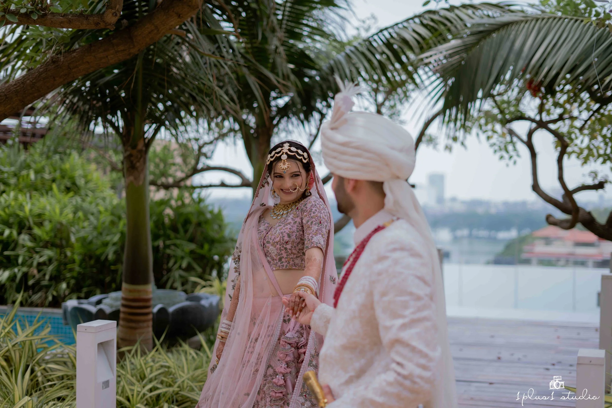
Dusty Rose and Ivory
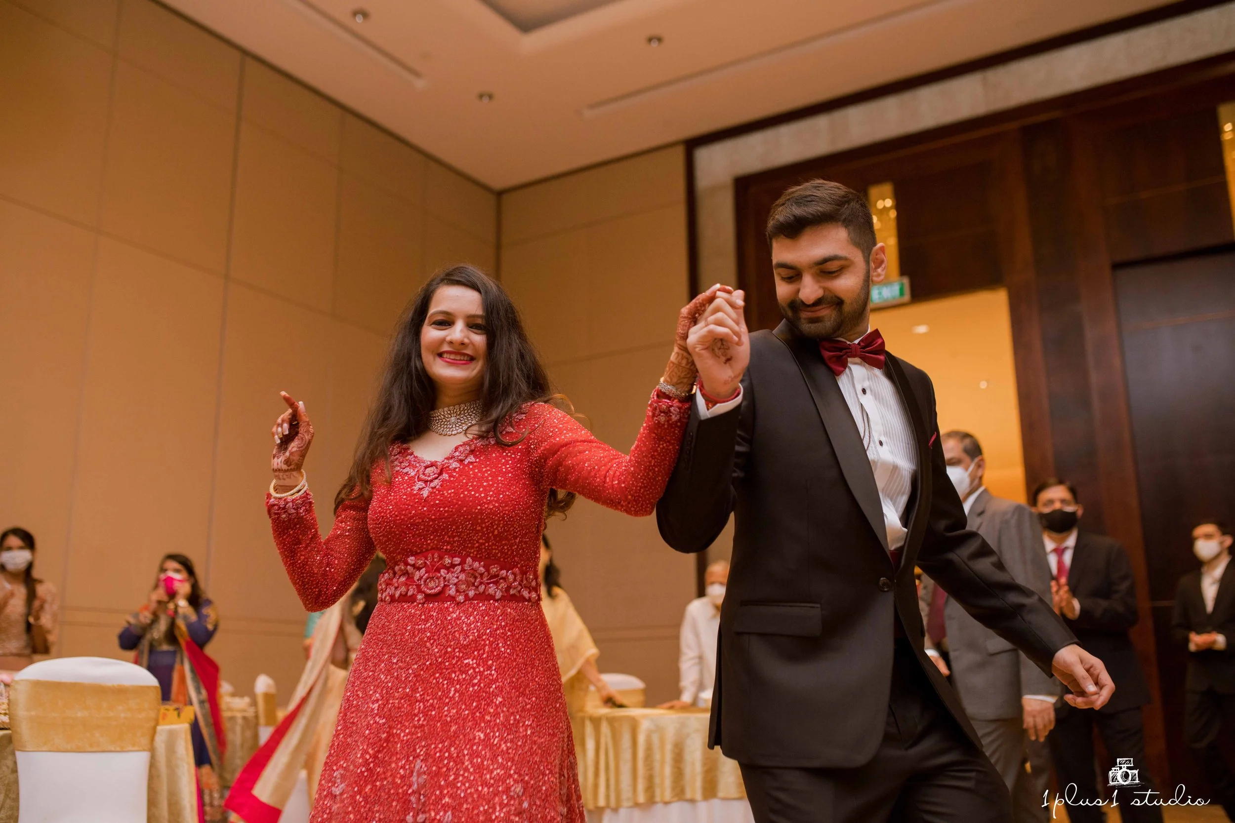
Romantic and versatile, dusty rose performs beautifully across function types — it is soft enough for a mehendi morning, rich enough for an evening reception. The muted quality of dusty rose (as opposed to bright pink) photographs without oversaturating, making it reliably beautiful on camera. Paired with warm ivory rather than pure white (which can read as clinical), this palette has a luxury quality that suits hotel ballroom settings. Works well at Four Seasons Bangalore and Leela Palace.
Sage and Champagne
The distinctly 2026 palette — sage has been building for three years and is now fully established as a premium wedding colour for South Indian urban weddings. Paired with champagne (a warm off-white with a slight golden cast), it creates an atmosphere of understated contemporary luxury. Particularly effective for outdoor garden settings where the sage reads as an extension of the natural landscape. The challenge: sage can read as low-energy under the wrong light. Warm lighting is essential for this palette to perform.
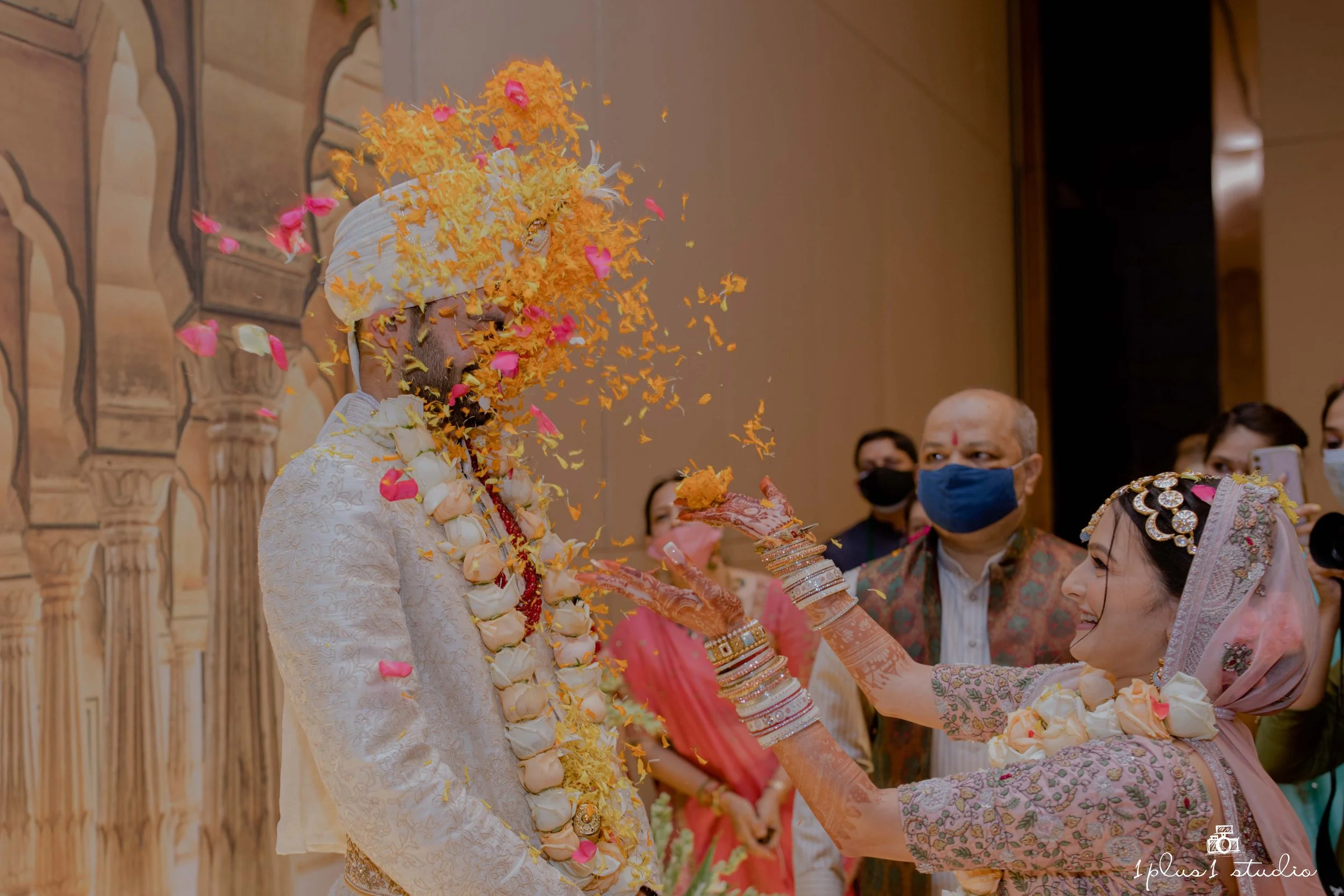
Marigold and Burgundy
The traditional South Indian palette, given a contemporary elevation. Marigold is the most South Indian of colours — its scent and visual intensity are inseparable from celebration in this geography. Paired with burgundy rather than the traditional red, the palette retains its cultural identity while gaining depth and sophistication. This combination works across functions from mehendi to reception and is particularly spectacular in evening settings when lit with warm amber light.
Navy and Gold
The classic formal Indian wedding palette remains entirely relevant. Navy provides a dramatic, rich background against which gold decor and metallic details register with maximum impact. It is particularly effective in indoor ballroom settings and for evening events. The risk: navy can look heavy and overpowering in smaller spaces or in full daylight. It requires a venue with appropriate ceiling height and good lighting control.
- Terracotta + Gold — earthy, camera-beautiful, South Indian resonance
- Dusty Rose + Ivory — romantic, versatile, flattering on camera
- Sage + Champagne — contemporary, fresh, outdoor-ready
- Marigold + Burgundy — traditional with elevation, evening drama
- Navy + Gold — formal, indoor, classic celebration
- Rust + Copper — rich, warm, twilight and candlelight weddings
Traditional South Indian Palettes — Still Relevant, Still Beautiful
Red, green, and gold — the traditional South Indian wedding palette — is not a trend and does not need to be. It is a statement of cultural identity and it remains extraordinary when executed with quality and intentionality. The distinction between a traditional South Indian palette that feels dated versus one that feels timeless is almost entirely in the execution: material quality, floral freshness, the precision of the design application.
Choosing Based on Your Venue's Existing Colours
This is the most practical guidance we give couples: photograph your venue before briefing your decor team, and bring those photographs to the palette discussion. The floor tile colour, the wall tone, the existing upholstery — these are fixed, and your palette must harmonise with them rather than clash. A cool-toned blue and white palette in a room with warm terracotta tile floors will always look uncomfortable. A warm-toned palette in the same room will look intentional.
How Lighting Changes Colour Temperature
The palette you choose in daylight will look different under event lighting. Warm white (2700–3000K) lighting shifts all colours toward amber, making terracotta and gold palettes glow and making cool-toned sage and white palettes look warm. Cool white (4000K+) lighting makes cool palettes clean and contemporary but can make warm, earthy palettes look washed out. The decision about lighting colour temperature should be made simultaneously with the palette decision, not after.
Palette Coherence Across Multiple Functions
A multi-day wedding with mehendi, sangeet, ceremony, and reception gives couples the opportunity to use different palettes per function — which many do. The most successful approach: each function has its own primary palette, but they share a tonal temperature (all warm, all jewel-toned, all muted and earthy). This creates variety across the event while maintaining a sense that the whole celebration belongs to the same story. Explore our wedding planning journal for more on designing across functions.
We start every project with a palette workshop — because colour is everything. Tell us your venue, your vision, and we'll develop a palette that is entirely yours.
Begin Your Story