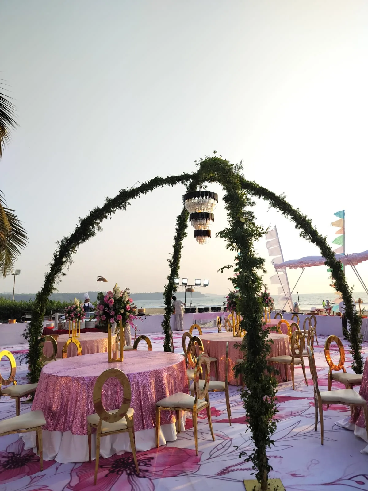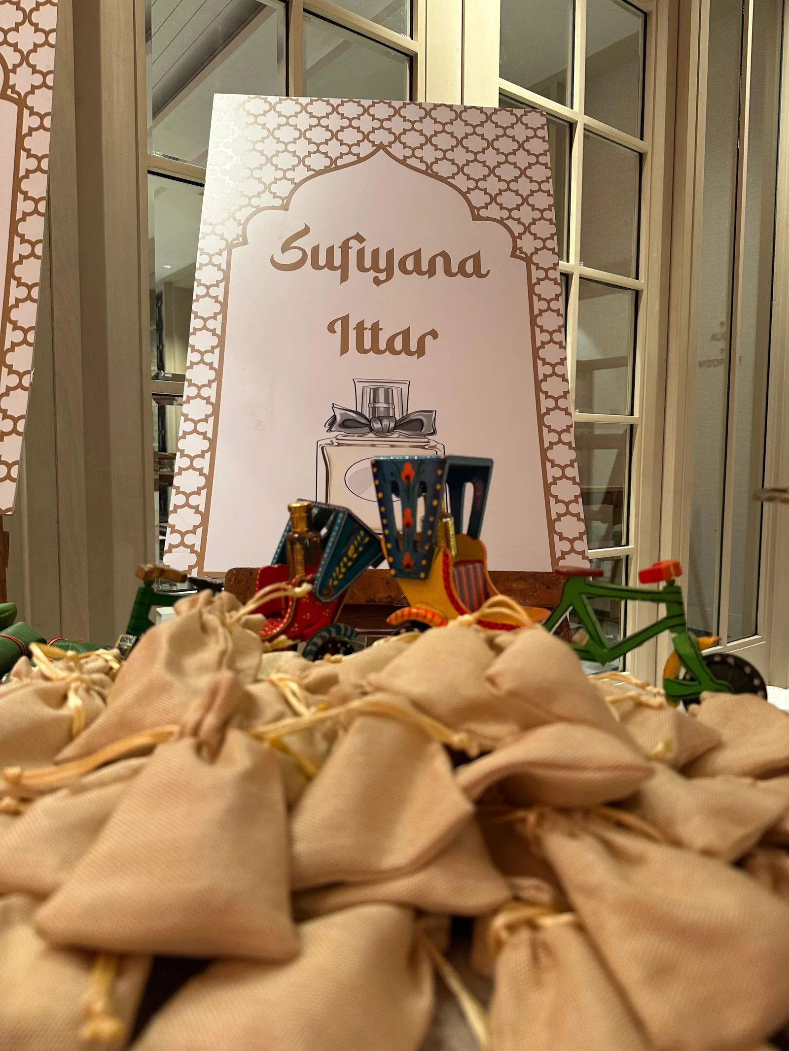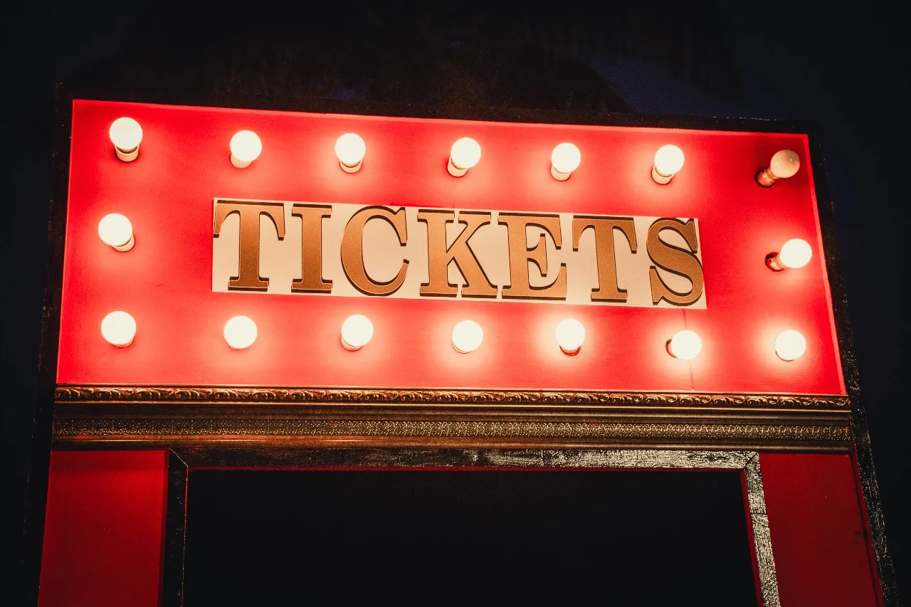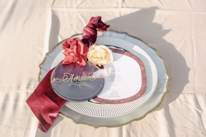
Weddings are designed from the stage outward — the mandap, the couple, the show — and guests get whatever is left. Flip the drawing once: for four hours, several hundred people need to know where to go, what to do, where their children are and where they can sit down. Solve those and every review of your wedding improves, because guests remember how a wedding treated them long after they forget the centrepieces.
Photo corners: one per event, built for how people actually pose
The generic flower-wall-plus-neon earns its clichés because it works — but the corners guests queue for are specific to the event and the place. Our haldi in Goa put a yellow Vespa against a Portuguese-tile arch; a mehendi at Amita Rasa ran a gajra bar — jasmine by the armful, a mirror, a sign saying adorn your hair — which is a photo corner that produces its own props on every guest who visits it. The mechanics that decide usage: place the corner on the natural walking route, not in a far corner; light it for phones, which means facing light, not backlight; make it work for groups of six, because Indian guests pose in battalions; and give it one interactive element — props, the gajra bar, an instant printer — because participation beats backdrop. One well-placed corner outperforms three scattered ones.
Planning this yourself? Send us your name and a number, and a planner will reply within 24 hours to talk it through with you, whoever you end up booking.
Panigrahana is a wedding design and planning studio with 500+ weddings since 2018, rated 4.8/5 on Google (checked 27 September 2026). Planning starts at ₹2 lakh per day for two events + GST and decor at ₹5 lakh + GST, quoted for the agreed scope rather than as a percentage of what you spend.
Kids: a zone, a person, a plan
Every wedding has thirty children and no plan for them, and the result roams the dance floor at knee height. The fix costs little: one defined corner — mats, low tables, colouring, building blocks, no screens required — placed within sightline of the parents' tables, and critically, a hired minder whose only job is that corner. Two more unlocks: feed the children first (a small early buffet of food children actually eat converts the entire parent population into people enjoying a wedding), and give the 8-to-12 band a job — petals to distribute, a Polaroid to run — because a deputised child is a delighted one. The investment returns as hours of adult attention at the event you spent a year designing.
Elders: comfort is a design brief, not an apology
Front-row seating near the ceremony with real backrests; a quiet seating pocket away from the speakers — sound levels that thrill the dance floor are genuinely punishing at eighty; the buffet's first stretch reachable without stairs, or a served table for the eldest; restrooms close to elder seating when the venue offers a choice; and one member of the crew told, by name, who the most senior family members are. In muhurtham weddings that start brutally early, a tea-and-seating station open before the ceremony is the kindest hundred rupees in the budget.
Signage and the welcome: the first five minutes
A guest's experience is set in the walk from car to seat. A welcome board that says whose wedding and what happens when; arrows at every decision point; schedules in both languages when the families read different ones — bilingual boards cost nothing extra to print and say everything about whose wedding this is. Welcome drinks at the entrance during arrival heat, and a hospitality desk at destination weddings — one table, one person, every answer — are the difference between guests who feel received and guests who feel processed.
The stage queue, rethought
The reception greeting line is the institution nobody enjoys: hundreds of guests, minutes each, a couple smiling through arithmetic that runs to hours. Options that respect both the custom and the clock: schedule the queue — announce that the stage receives guests between fixed times, so nobody queues during dinner; run it in blocks with breaks so the couple eats; or invert it for part of the evening, with the couple making table rounds while a photographer trails. Families feel strongly here, and the custom carries real meaning for elders — the design job is not abolishing the queue but capping what it costs the couple. Two hours of a wedding is a high price for anyone's photograph.