Wedding Colours: Test Fabric, Flowers and Outfits Together
A practical colour approval test for your Bangalore wedding: compare samples in daylight and event lighting before approving the décor palette.
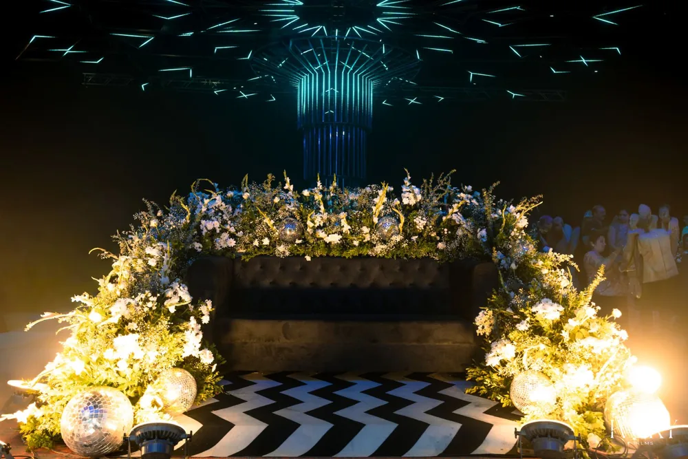
To approve wedding colours, review the fabric, flowers and outfit references together in daylight and under the proposed event lighting. Record the accepted samples and any permitted substitutions. A screen moodboard sets a direction; it cannot confirm how the materials will look in the room.
Begin with the colours you actually want
A discussion about a trending wedding palette can hide a simpler concern: will I regret choosing what I like? Start with the clothing and colours you are already comfortable wearing. If the ceremony outfit is fixed, use it as a reference for the décor review without asking every chair, flower and invitation to match it.
For a Bangalore garden wedding, include the setting in that review. Existing greenery, stone, a coloured stage wall or a hotel carpet will sit beside your palette. Ask for a wide view that includes them. A cropped reference can conceal the very colour that makes the proposed palette difficult to use.
Make a small physical sample set
Ask for the proposed drape or linen, an example of the floral colour, and the finish of visible furniture or structures. A supplier may not be able to provide every flower in advance; record what is an actual sample and what remains a reference. Include a neutral sample so the team has a common point of comparison.
Review the samples together. A warm white cloth and a cool white flower can look different beside each other even if both were described as ivory in a chat. Decide whether that difference is acceptable rather than trying to resolve it from compressed phone pictures.
Run the same comparison twice
Look at the sample set in the daylight conditions closest to the function and under the proposed evening lighting. Ask the photographer to flag obvious problems in how the backdrop, clothing and faces will be recorded. Keep a photograph of the review as a record, while remembering that another screen may display it differently.
If you are planning from abroad, request one continuous video of the materials in the room as well as individual photos. Ask the team to identify each material aloud and point out what is provisional. One collage with different edits on each photograph makes comparison harder.
Record an approval people can use
| Element | Record | Avoid relying on |
|---|---|---|
| Main fabric | Supplier reference, sample photograph, accepted colour | A colour name alone |
| Flowers | Intended colour and acceptable variation | A promise of identical natural blooms |
| Lighting | Reviewed lighting scene and responsible operator | A photograph with unknown editing |
| Outfits | Reference shared privately with the design team | A guess based on the invitation |
| Substitutions | Who approves a change and its cost | Silence in a group chat |
Give each function a reason to look different
You do not need an unrelated theme for every event. A ceremony and evening party can share a colour family while using different materials and lighting. Decide which parts of the setting will stay visible between functions, then ask the team to show how the change works.
This matters when the turnaround is short. If the room must be emptied, re-draped and relit, the schedule is part of the design. Ask what guests will do during that period and whether suppliers have enough access to complete the approved work.
Use trend reports as references, not deadlines
Current editorial coverage includes both saturated colours and softer palettes. That is a range of choices, not a rule that one colour has replaced every other. Pick the direction that works with your clothes, ceremony, venue and budget.
Once the samples are approved, keep new inspiration separate from the final brief. If you decide to change the palette, request a revised scope before purchases start. The useful final document is a dated selection sheet, not a folder that keeps gaining contradictory screenshots.
Questions couples ask
Do the wedding outfits and décor have to match?
No. Review them together so the contrast is intentional. A coordinated setting can use complementary colours and neutral space without repeating the outfit colour everywhere.
Can I approve colours entirely over WhatsApp?
You can communicate decisions there, but identify the materials and keep a dated approval record. Photos and screens vary, so ask for a material sample or a consistent video review where possible.
Should every function use a different palette?
Only if you want that difference and the setup plan supports it. Related palettes can work across functions; ask how the team will change the materials and lighting within the available time.